BILLMOORE
LASSETER: WHILE ATTENDING CALARTS, I WAS FORTUNATE TO HAVE A WONDERFUL DESIGN TEACHER, BILL MOORE. IF YOU COULD SURVIVE HIS CLASS - HE WAS VERY INTIMIDATING, MOORE DIDN'T SPARE ANY FEELINGS IF HE SINGLED OUT YOUR DRAWING AS THE DAY'S DESIGN FAILURE!, YOU LEFT ART SCHOOL WITH A SOLID DESIGN AND COLOR SENSE. LINE, RHYTHM, POSITIVE, NEGATIVE SPACES, PACING - IT'S ALL RELATED, REGARDLESS WHETHER YOU ARE ANIMATING, DRAWING OR SCULPTING.

BILL MOORE had seen more than his fair share of magnificent as well as challenging student work during a teaching career that spanned over four decades. The legendary Chouinard Art Institute instructor of the 1940s, 50s, 60s, and 70s–then briefly at CalArts–had a reputation for challenging the mediocrity out of his students while also turning out some of the best creative talent across multiple eras.
Those students inspired by his intensive methods include Pixar chief creative officer John Lasseter; producer, director and animator Tim Burton; director Henry Selick; Emmy-winning fashion and costume designer Bob Mackie; Columbia Records creative director S. Neil Fujita; photographer and legendary Blue Note Records graphic designer Reid Miles; three times Oscar-nominated costume designer Theodora Van Runkle; and award-winning designer and illustrator Leo Monahan. Add to this list a cadre of all-star animators whose work has populated the ranks of the Disney Studios up through and including today. The list truly goes on.
Prof. Moore’s most enduring takeaway simply states, “Two principles underlie all forms of human expression…unity and rhythm”.
I thought Bill Moore's best observation was that (paraphrased after 30+ years) "Absolute artistic freedom is absolute bullsh*t. All great art is created under constraint and struggle - an audience appreciates seeing something made out of little or nothing. Kiddies." Years after school Peter Chung (experimental animator who took some crossover Disney classes) and I agreed that Bill was the most influential teacher there. He drew smart parallels between 'primitive' sculpture and animation: humans amplifying and caricaturing the most important aspects of their lives. Some of his most engaging assignments were based on primitive art, in fact, Peter put him in his student film - a circus ringleader, I recall. .
What would you say what was the most important think you got out going to art school?
Chris Bailey: "The culture, I don't men the culture from the book learning, but from the artists and faculty. My sense of what was good drawing, acting and design was focused by me relationships theres. My design instructor Bill Moore, often said that everything he taught was to be found in nature. He didn't draw, at least in class, but I learned about drawing animation and timing from him than any of my other instructors. He had this funny quote about people and art ,. . . that when people said that they didn't know much about art, but they knew what they liked, he said what they meant was that they liked what they knew . . . which wasn't very much. He made you want to keep searching learning.
PAULKLEE
COLOR IS THE PLACE WHERE OUR BRAIN AND THE UNIVERSE MEET.
A drawing is simply a line going for a walk.

Paul Klee essentially developed his theory of art during his time at the Bauhaus. In 1920, in his book on the theory of art, ‘Creative Confession’, he stated, ‘Art does not reproduce the visible but makes it visible.’ Many other essays and lectures on art education and theory followed, while Klee taught at the Bauhaus: about the study of nature, the creative mindset and form theory. In 1925, the foundations of his design theory were published as the second of the Bauhaus books (‘Pedagogical Sketchbook’). Klee’s colour and form theories were an elementary part of the preliminary course. Their contents reached the majority of Bauhaus students between 1921 and 1931.
Influenced by the theories of Goethe, Runge, Delacroix and Kandinsky, Klee developed his own colour theory based on a six-part rainbow shaped into a colour wheel. He placed the complementary colours in relation to movements that interact with one another, which shows this theory is based on dynamic transitions. For Klee, because art and theory were inseparably linked, the element of movement flowed into the compositions of his colour gradations and Quadrat (square) paintings.
In the nine lessons of his form theory, Klee explored works of art with regard to ‘the stages of [their] creation’. The point that sets itself in motion stood at the beginning of his considerations and the movement of colour as part of this process at their conclusion. As a master of form, Klee was initially the head of the bookbinding workshop. Due to his experiences with reverse painting on glass, he subsequently became the head of the glass-painting workshop. From 1923, he was head of the course Elementary design theory of surfaces for the second semester. At times, he also taught life drawing. In Dessau, from 1926, Klee taught a painting class at his own request. In 1927, he also taught form theory in the weaving workshop after the departure of Georg Muche, where he taught his colour theory and gave lessons on the design of surfaces. His teaching aspired to the ‘development of multiplicity into unity’. Klee’s influence on the expression of form in the weaving workshop played a large role in shaping this workshop.
In his approach to art, Klee attempted to avoid dogma of all kinds. He aimed to teach the foundations of colour and form to the students so that they could continue to work with these elements on an individual basis. There were no difficult discussions about radical life concepts of the sort entertained by Johannes Itten, because Klee always strove for harmony. Due to his pleasant but profound way of imparting knowledge, he was known at the Bauhaus as the ‘magician’.


JOHANNESITTEN
THE KINGDOM OF COLORS HAS WITHIN IT MULTIDIMENSIONAL POSSIBILITIES ONLY
PARTLY TO BE REDUCED TO SIMPLE ORDER. EACH INDIVIDUAL COLOR IS A UNIVERSE
IN ITSELF.

The study of color at the Bauhaus was shaped by a diverse body of previously developed artistic, psychological, and scientific theories of color, tested and innovated through practical exercises. Johannes Itten’s reinterpretation of romantic painter Philipp Otto Runge’s color sphere formed the basis of color instruction in the Preliminary Course. Created in 1921, Itten’s color star unfolds and flattens Runge’s sphere in order to display its dark-light polarities on a single plane. These poles, represented by the white center of the star and its black tips, contained between them endless possibilities for the study of contrasting color effects.
Itten identified seven fundamental categories of contrast: hue, light-dark, cold-warm, complementary, analogous, saturation, and extension. The color star modeled several of these. It featured six concentric circles, representing the surface of Runge’s sphere, with twelve “meridians” radiating from their circumference. Each meridian line dissects the center of the circles to hit its polar opposite in space, while an “equatorial zone” displays the twelve pure colors from a classic twelve-hue color wheel. Itten explained how the star could be used to study color contrasts: “Reading outward, we have the zones of tints, the zone of the pure hues [equatorial zone], and the two zones of shades, with black at the extreme points of the star.”
Itten’s color star was just one among many variations on the standard color wheel that Bauhaus masters and students developed through pedagogical exchange. Paul Klee developed a theory of color that began with the line and led, through mutations in direction and acceleration, toward the color wheel. Vassily Kandinsky arrived at the Bauhaus already a renowned expert on color theory. His book On the Spiritual in Art established distinct emotional and spiritual associations between specific colors and forms. He theorized these associations as general artistic principles.
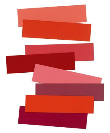
Unlike Kandinsky’s belief in an essential association between form and color, Josef Albers theorized color’s absolute relativity. Albers insisted that “color, as the most relative medium in art, has innumerable faces or appearances. To study them in their respective interactions, in their interdependence, will enrich our ‘seeing,’ our world—and ourselves.”


JOSEFALBERS
In visual perception a color is almost never seen as it really is - as it physically is. This fact makes color the most relative medium in art.

Josef Albers entered the room, carrying with him a bunch of newspapers. … then addressed us … “Ladies and gentlemen, we are poor, not rich. We can’t afford to waste materials or time. … All art starts with a material, and therefore we have first to investigate what our material can do. So, at the beginning we will experiment without aiming at making a product. At the moment we prefer cleverness to beauty. … Our studies should lead to constructive thinking. … I want you now to take the newspapers … and try to make something out of them that is more than you have now. I want you to respect the material and use it in a way that makes sense — preserve its inherent characteristics. If you can do without tools like knives and scissors, and without glue, the better.
Josef Albers believed that teaching art was not a matter of imparting rules, styles, or techniques, but of leading students to a greater awareness of what they were seeing. Albers said his goal as a teacher was "to open eyes." For Albers, the fundamental building block of an art education was development of the capacity to see more acutely. You can’t be an artist, Albers reasoned, unless and until you’d mindfully explored the visual field through its key elements: line, shape, color, and texture.
Albers taught courses in design and drawing at the Bauhaus. At Black Mountain College, he gave courses in those same subjects as well as in color and painting. When he assumed the chairmanship of the Department of Design at Yale, Albers scrapped the existing curriculum and replaced it with instruction in the fundamentals of design, drawing, and color. His workshops at the Harvard School of Design, his instruction as visiting professor at the Hochschule für Gestaltung in Ulm, Germany, and his many workshops and courses in schools and universities across the United States and in Latin America were devoted entirely to these same subjects.
Albers’s approach relied on direct observation and self-discovery. His classes were peppered with analyses of such commonplace phenomena as New York City streetlights, monuments in the park, and insect anatomy. Absorbed in visual phenomena, he would point out what others had perhaps viewed cursorily but not contemplated: the shape of the Yale football stadium, the spot of light that remains for a moment when a TV set is switched off, the way a red roof could merge with a blue sky, how the color of tea deepened in a glass. Albers was, as his paintings and graphics reveal, profoundly sensitive to the formal relationships of things, intensely conscious that everything in the visual field exists in a context, and that every line and color affects adjacent line and colors.
What do we actually see? How well do we see it? How can we translate our discoveries into meaningful work? Albers felt that these concerns, rather than theories about form, should be the focus of art training.
Accordingly, his lessons introduced his students to an often-unseen visual reality. Through a battery of simple freehand line exercises, students discovered that lines and shapes formed relationships, established rhythms and tensions, pushed and pulled. By drawing their names in reverse, by imitating newspaper text, or by drawing the block letters or numbers they had seen all their lives, they began to recognize that these were forms having distinct character. Writing their names in reverse or upside down, drawing letterforms, or carefully recording the shapes they saw between the rungs of chairs, they became aware of "negative" or "unfilled" shapes. Painting the spaces between milk bottles, oranges, or the leaves of plantsreinforced the lesson that the space is never merely "empty." By constructing with simple materials, such as paper or wire, students learned that the hollows and voids were as important as the solids. Juxtaposing colors, or combining disparate materials in assemblages, they learned to recognize the influence of one element upon another. The laboratory-like simplicity of the exercises made it possible to observe the smallest, subtlest events in the visual field—the precise shade of a color, the exact nature of a curve, or the character of a paper’s torn edge.
Probably no one has surpassed Albers in finding ways to develop visual skills. His exercises were powerful tools of his pedagogy. But his sense of wonder, coupled with his remarkable ability to share his visual world with others, animated whatever he touched. Albers was imbued with the Bauhaus imperative that art and life are of a piece, but he put his own spin on the concept. "Learn to see and to feel life," he wrote, "cultivate imagination, because there are still marvels in the world, because life is a mystery and always will be. But be aware of it. . . . Art means: you have to believe, to have faith, that is, to cultivate vision."