CEZANNE - When I judge art, I take my painting and put it next to a God made Object like a tree or flower, if it clashes it is not art.
Bill Moore
I II III
Color
& Design
What would you say what was the most important think you got out going to art school?
Chris Bailey: "The culture, I don't men the culture from the book learning, but from the artists and faculty. My sense of what was good drawing, acting and design was focused by me relationships theres. My design instructor Bill Moore, often said that everything he taught was to be found in nature. He didn't draw, at least in class, but I learned about drawing animation and timing from him than any of my other instructors. He had this funny quote about people and art ,. . . that when people said that they didn't know much about art, but they knew what they liked, he said what they meant was that they liked what they knew . . . which wasn't very much. He made you want to keep searching learning.

BILLMOORE
Lasseter: While attending CalArts, I was fortunate to have a wonderful design teacher, Bill Moore.
If you could survive his class - he was very intimidating, Moore didn't spare any feelings if he singled out your drawing as the day's Design Failure!, you left art school with a solid design and color sense.
Line, rhythm, positive, negative spaces, pacing - it's all related,regardless
whether you are animating, drawing or sculpting.
Lasseter: While attending CalArts, I was fortunate to have a wonderful design teacher, Bill Moore. If you could survive his class - he was very intimidating, Moore didn't spare any feelings if he singled out your drawing as the day's Design Failure!, you left art school with a solid design and color sense. Line, rhythm, positive, negative spaces, pacing - it's all related, regardless whether you are animating, drawing or sculpting.

BILL MOORE had seen more than his fair share of magnificent as well as challenging student work during a teaching career that spanned over four decades. The legendary Chouinard Art Institute instructor of the 1940s, 50s, 60s, and 70s–then briefly at CalArts–had a reputation for challenging the mediocrity out of his students while also turning out some of the best creative talent across multiple eras.
Those students inspired by his intensive methods include Pixar chief creative officer John Lasseter; producer, director and animator Tim Burton; director Henry Selick; Emmy-winning fashion and costume designer Bob Mackie; Columbia Records creative director S. Neil Fujita; photographer and legendary Blue Note Records graphic designer Reid Miles; three times Oscar-nominated costume designer Theodora Van Runkle; and award-winning designer and illustrator Leo Monahan. Add to this list a cadre of all-star animators whose work has populated the ranks of the Disney Studios up through and including today. The list truly goes on.
Prof. Moore’s most enduring takeaway simply states, “Two principles underlie all forms of human expression…unity and rhythm”.
I thought Bill Moore's best observation was that (paraphrased after 30+ years)
"Absolute artistic freedom is absolute bullsh*t. All great art is created under constraint and struggle - an audience appreciates seeing something made out of little or nothing. Kiddies.' Years after school Peter Chung (experimental animator who took some crossover Disney classes) and I agreed that Bill was the most influential teacher there. He drew smart parallels between 'primitive' sculpture and animation: humans amplifying and caricaturing the most important aspects of their lives. Some of his most engaging assignments were based on primitive art, in fact, Peter put him in his student film - a circus ringleader, I recall. .
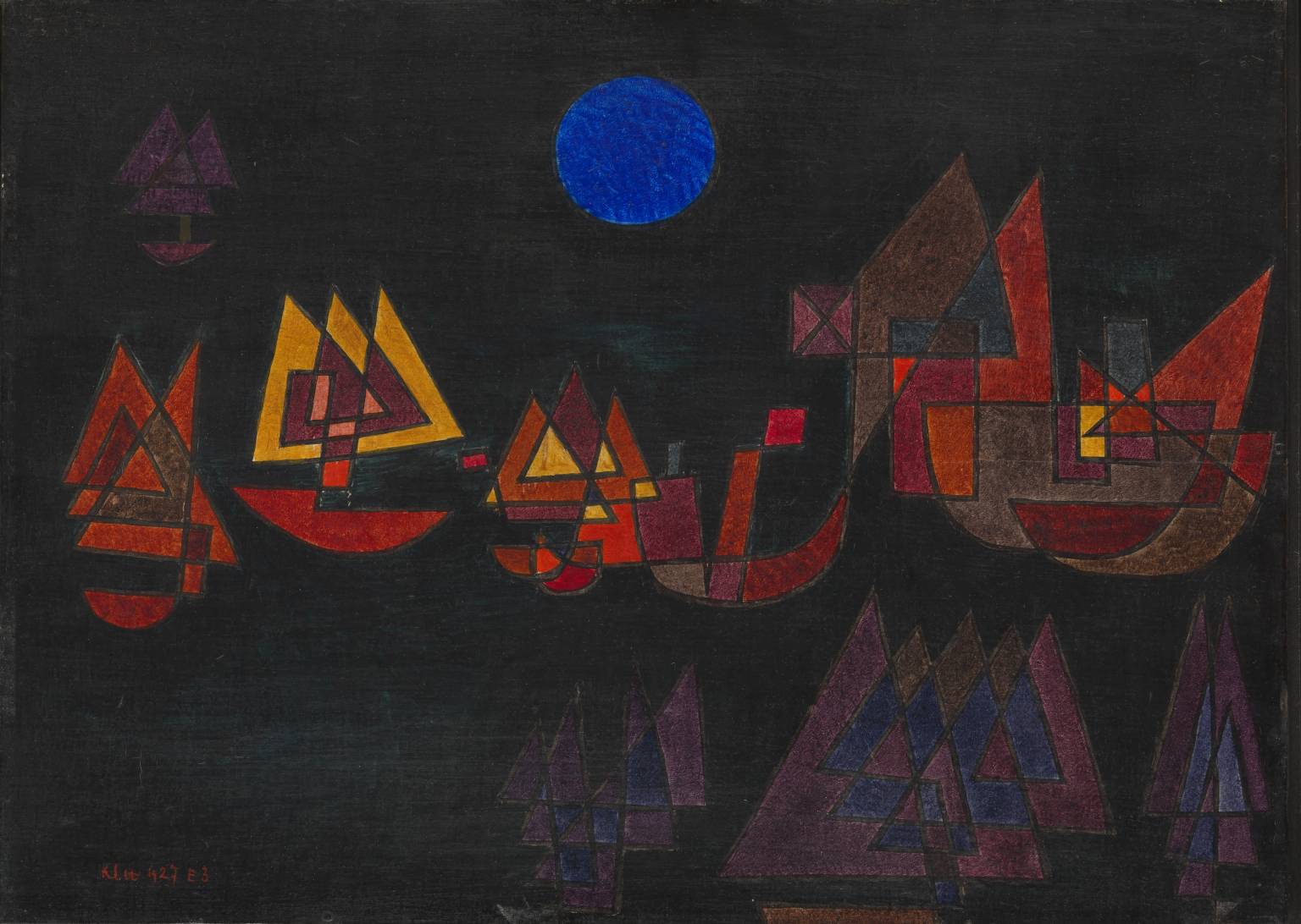
Paul Klee
"Color is the place where our brain and the universe meet."
"A drawing is simply a line going for a walk."

Paul Klee essentially developed his theory of art during his time at the Bauhaus. In 1920, in his book on the theory of art, ‘Creative Confession’, he stated, ‘Art does not reproduce the visible but makes it visible.’ Many other essays and lectures on art education and theory followed, while Klee taught at the Bauhaus: about the study of nature, the creative mindset and form theory. In 1925, the foundations of his design theory were published as the second of the Bauhaus books (‘Pedagogical Sketchbook’). Klee’s colour and form theories were an elementary part of the preliminary course. Their contents reached the majority of Bauhaus students between 1921 and 1931.
Influenced by the theories of Goethe, Runge, Delacroix and Kandinsky, Klee developed his own colour theory based on a six-part rainbow shaped into a colour wheel. He placed the complementary colours in relation to movements that interact with one another, which shows this theory is based on dynamic transitions. For Klee, because art and theory were inseparably linked, the element of movement flowed into the compositions of his colour gradations and Quadrat (square) paintings.
In the nine lessons of his form theory, Klee explored works of art with regard to ‘the stages of [their] creation’. The point that sets itself in motion stood at the beginning of his considerations and the movement of colour as part of this process at their conclusion. As a master of form, Klee was initially the head of the bookbinding workshop. Due to his experiences with reverse painting on glass, he subsequently became the head of the glass-painting workshop. From 1923, he was head of the course Elementary design theory of surfaces for the second semester. At times, he also taught life drawing. In Dessau, from 1926, Klee taught a painting class at his own request. In 1927, he also taught form theory in the weaving workshop after the departure of Georg Muche, where he taught his colour theory and gave lessons on the design of surfaces. His teaching aspired to the ‘development of multiplicity into unity’. Klee’s influence on the expression of form in the weaving workshop played a large role
in shaping this workshop.
In his approach to art, Klee attempted to avoid dogma of all kinds. He aimed to teach the foundations of colour and form to the students so that they could continue to work with these elements on an individual basis. There were no difficult discussions about radical life concepts of the sort entertained by Johannes Itten, because Klee always strove for harmony. Due to his pleasant but profound way of imparting knowledge, he was known at the Bauhaus as the ‘magician’.


Johannes Itten
"The kingdom of colors has within it multidimensional possibilities only partly to be reduced to simple order. Each individual color is a universe in itself."

The study of color at the Bauhaus was shaped by a diverse body of previously developed artistic, psychological, and scientific theories of color, tested and innovated through practical exercises. Johannes Itten’s reinterpretation of romantic painter Philipp Otto Runge’s color sphere formed the basis of color instruction in the Preliminary Course. Created in 1921, Itten’s color star unfolds and flattens Runge’s sphere in order to display its dark-light polarities on a single plane. These poles, represented by the white center of the star and its black tips, contained between them endless possibilities for the study of contrasting color effects.
Itten identified seven fundamental categories of contrast: hue, light-dark, cold-warm, complementary, analogous, saturation, and extension. The color star modeled several of these. It featured six concentric circles, representing the surface of Runge’s sphere, with twelve “meridians” radiating from their circumference. Each meridian line dissects the center of the circles to hit its polar opposite in space, while an “equatorial zone” displays the twelve pure colors from a classic twelve-hue color wheel. Itten explained how the star could be used to study color contrasts: “Reading outward, we have the zones of tints, the zone of the pure hues [equatorial zone], and the two zones of shades, with black at the
extreme points of the star.”
Itten’s color star was just one among many variations on the standard color wheel that Bauhaus masters and students developed through pedagogical exchange. Paul Klee developed a theory of color that began with the line and led, through mutations in direction and acceleration, toward the color wheel. Vassily Kandinsky arrived at the Bauhaus already a renowned expert on color theory. His book On the Spiritual in Art established distinct emotional and spiritual associations between specific colors and forms. He theorized these associations as general artistic principles.
Unlike Kandinsky’s belief in an essential association between form and color, Josef Albers theorized color’s absolute relativity. Albers insisted that “color, as the most relative medium in art, has innumerable faces or appearances. To study them in their respective interactions, in their interdependence, will enrich our ‘seeing,’ our world—and ourselves.”
Josef Albers
In visual perception a color is almost never seen as it really is - as it physically is. This fact makes color
the most relative medium in art.

Josef Albers entered the room, carrying with him a bunch of newspapers. … then addressed us … “Ladies and gentlemen, we are poor, not rich. We can’t afford to waste materials or time. … All art starts with a material, and therefore we have first to investigate what our material can do. So, at the beginning we will experiment without aiming at making a product. At the moment we prefer cleverness to beauty. … Our studies should lead to constructive thinking. … I want you now to take the newspapers … and try to make something out of them that is more than you have now. I want you to respect the material and use it in a way that makes sense — preserve its inherent characteristics. If you can do without tools like knives and scissors, and without glue, the better.


PAULKLEE
Color is the place where our brain and the universe meet.
BILLMOORE
Lasseter: While attending CalArts, I was fortunate to have a wonderful design teacher, Bill Moore. If you could survive his class - he was very intimidating, Moore didn't spare any feelings if he singled out your drawing as the day's Design Failure!, you left art school with a solid design and color sense. Line, rhythm, positive, negative spaces, pacing - it's all related, regardless whether you are animating, drawing or sculpting.
Josef Albers
"In visual perception a color is almost never seen as it really is - as it physically is. This fact makes color the most relative medium in art."
